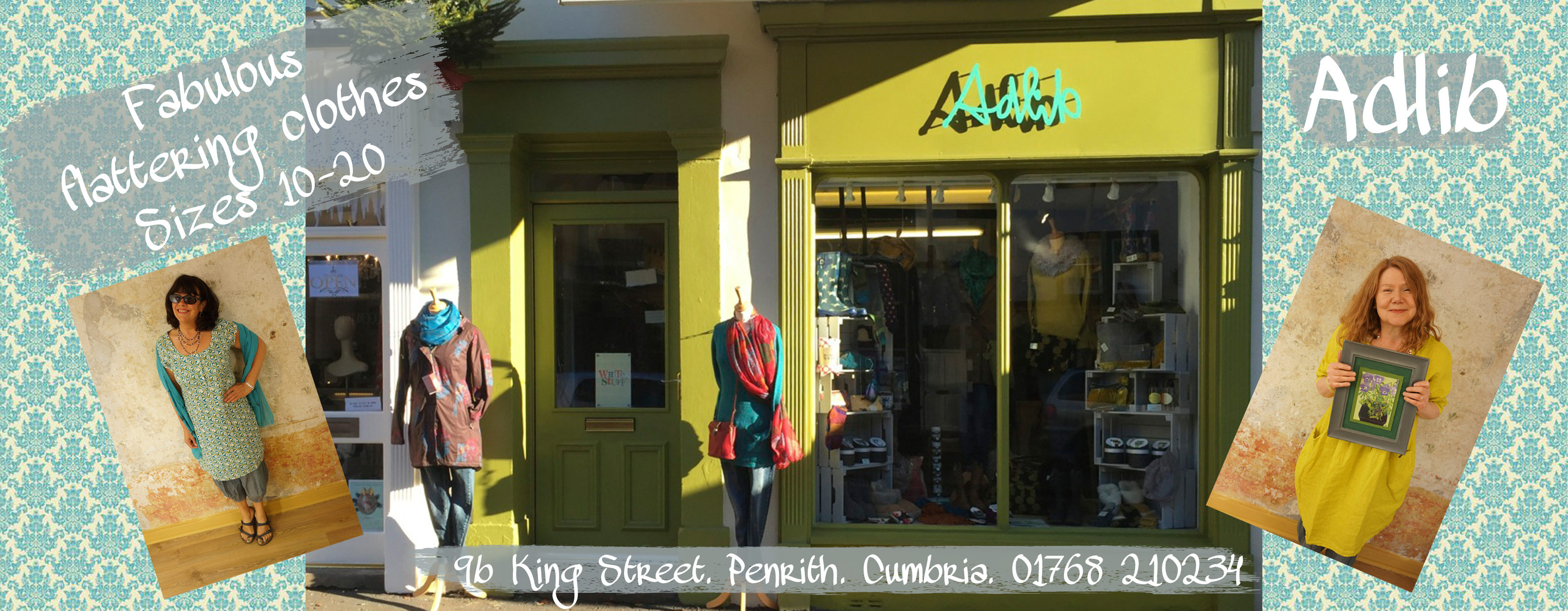
Cisco Application Guidelines
To help Cisco guide its many app developers create a consistent look and feel between their disparate apps for Android and iOS, I created a kit of Photoshop assets and helped write guidelines explaining the recommended do’s and don’ts of Cisco’s visual language.
Client:
Cisco
Budget:
EightShapes
Skills:
- Visual Design
- Art Direction
- Application Design
- User Experience Design
- Guideline Writing

Templates
I created several templates for iOS and Android that focused on atomic elements like buttons, icons and the overall typography. Working upward I also created more molecular elements like tab bars, nav bars, list views, and product descriptions.
Those templates served several purposes:
- Several example screens built from the templates were used as illustrations in the projects guidelines book.
- The templates became a helpful deliverable for developers to understand all the components they had at their disposal; components could be combined in hundreds of different ways to create new screens.
- The templates also evolved into many screen examples; launch screens, sign-in screens, product screens, etc.
Templates were available in two widths: small (smart phones) and medium (tablet).
Guidelines for Variation and Consistency
Several color themes were crafted to add an element of variety in a project that was otherwise about being consistent. The guidelines I helped to author reinforced that mixing themes was not allowed. Those guidelines also included art direction for spacing, element size; font use, iconography and photography.


Iconography
Cisco owns a large, ever-growing and evolving icon library. To make sure app developers use the same icons between apps (and be consistent about it) I helped to create a matrix of icons outlining use and location; navigation bar, tab bar, or toolbar.